
Terra Firma
Six decades of trust, dressed for the decades ahead.
Terra Firma had earned sixty years of loyalty for its industrial equipment — while its graphics stayed stuck in another century. The assignment needed a careful hand: freshen the marque without losing the distributors and site managers who had relied on the old badge for years.
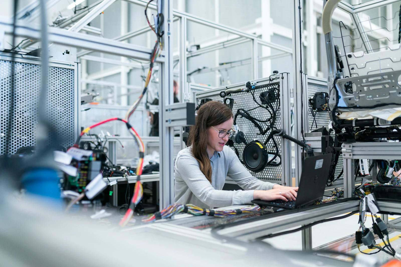
We protected what carried weight — the wordmark's posture, the deep green — then reconstructed the rest: a crisper monogram, a workhorse grotesque pairing, and a photographic approach that frames the machinery and its operators as equals.
Inside the commission
- Conversations with staff at three factories plus two dealer networks
- Complete marque system: monogram, wordmark, colour, type, icons
- A 120-page standards manual with a ready-to-edit template set
- Debut campaign: exhibition stand, short film and dealer rollout pack
The road we took
Research began among the machines rather than in meeting rooms. A fortnight of floor interviews revealed fierce employee pride — paired with embarrassment at handing prospects a tired brochure. The strategy wrote itself from that gap: proven heritage, visibly at work.
Design moved in three intensive rounds with the client's people alongside us, so the unveiling felt shared instead of imposed. Release was timed to the sales year, premiering at the firm's flagship annual trade fair.

Where it landed
The refreshed marque reached every dealer inside a single quarter and now appears across crates, vans and paperwork alike. Terra Firma reports fresh partnership conversations with purchasers a generation younger than its traditional base — precisely the crowd the project set out to win over.