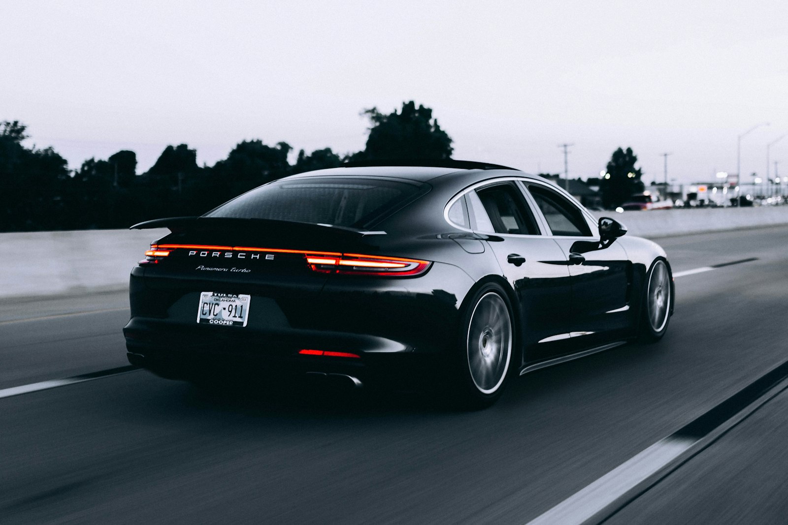
Serene
Understated luxury you sense before you parse.
Serene shapes electric grand tourers for motorists who consider ostentation — on the road or on the page — tasteless. Its former graphics leaned on the chrome-and-velocity tropes of a previous motoring era. The task was to design composure: a marque with space to breathe.
The answer pairs a wide-set wordmark with generous open space, a dawn-derived palette of misted tones, and movement rules that glide instead of slice.
Inside the commission
- Marque review spanning showrooms, digital channels and owner gatherings
- Visual toolkit: letterspacing logic, colour, typography, image standards
- Reveal-event film concept plus full art direction on the night
- Direction for the online configurator with a reusable component set
The road we took
We joined owners and engineers on sunrise drives, noting the vocabulary they kept returning to: composed, certain, effortless. Those words hardened into rules — each composition had to justify its elements the way the car justifies its quiet.
Concepts were proven where they would live: mocked at showroom scale, projected at event scale, then shrunk to a handset held at arm's length. Anything that only flattered one format was discarded.

Where it landed
The identity premiered with the model-year unveiling and now carries showrooms, the configurator and owner correspondence. Launch coverage kept remarking on the marque's new visual self-assurance — sentiment shifting exactly where the strategy pointed.